

The data pipeline
We are very grateful to the School of Data for their clear explanation on how the data pipeline works!
Once you have a clear understanding of your data action cycle, stakeholders and targets, you can begin manipulating data. The process of working with data can be broken down into the following five steps:
-
Step 1: Finding the data

Sometimes evidence is data that has already been collected. You could check government portals, open data portals and international organizations like the World Bank for data that you can use as evidence. In other cases, data has not been collected yet so you have to go about the process of collecting it yourself. Data sources will be addressed in more detail in Data Advocacy Basics, Pt III: Data Sources.
-
Step 2: Examining the data
To be able to examine your data you will need to add it to a tool such as a spreadsheet, which will allow you to examine the data. When examining data it is important to consider whether the data is complete or whether it is all the data you need. Thinking about the quality is also important; for example, are there errors or inconsistencies? Are things like addresses standardized? Then take a look and identify the data types that you have in your spreadsheet.
Sometimes data is in a format that is not user-friendly or is difficult to access. There are various tools and techniques you can use to manipulate and understand such data and use it to further your goal, which will be addressed in the following sections.
-
Step 3: Cleaning the data
Data is often disorganized, making analysis and manipulation into visualizations very difficult. Therefore, before you can use the data, you must clean the data — for example, removing unnecessary spacing, fixing inconsistencies in spelling or correcting misspelled words. One of the best things you can do when cleaning data is reconciling categories, which means that the same thing is categorized multiple times with different categories.
Useful tools for cleaning data include:
- Microsoft Excel
- Mac Numbers
- LibreOffice Calc
- OpenRefine
Cleaning data, however, is not always just about the tools; expertise is also important. Wording and codes might be difficult for everyone to understand, and they can be quite hard for people to access. Data can also cover technical subjects, which makes knowledge and understanding of technicalities such as procurements, public budgets and expenditures necessary. Therefore, expertise along with the right tools is important.
-
Step 4: Analyzing the data
In the analysis step you will try to make sense of the data and ask, “What is the story behind this information?” This means that you will need to do some detective work with the data to look at it closely and ask some key questions. For example, are you looking for comparisons and contrasts, do you want to compare general magnitude or quantities? Are there trends and patterns in the data indicating change over time? Are there relationships and connections that are worth looking at? Are there key associations to examine? You should be looking for patterns, abnormalities, things that stand out and things that can tell a story.
In terms of tools for data analysis, OpenRefine is popular and user friendly. In addition, spreadsheets such as Microsoft Excel, OpenOffice, LibreOffice and Mac Numbers allow you to easily analyze data and are recommended to master using before moving on to more complex tools for analysis.
The School of Data also offers courses and tools in how to find, clean and analyze data and how to use spreadsheets to analyze your data.
-
Step 5: Presenting the data
Once you have analyzed your data and discover patterns and a story, you can begin working on the presentation of your story through visualizations. When working with data visuals you will need to know your audience. What visuals will resonate with your audience? How will they react? As for your message, make sure it is strong, direct, and, most of all, simple. Does your visual get the message across? Your data visual will be the foundation that will get your audience to understand the scale and importance of your message.
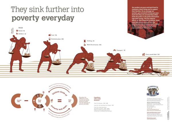
There are lots of tools available that can help you with making a preliminary data visualisation in the form of charts and infographics, which are graphic visual representations of information. Using software is a great first step in visualising your data. If you are working with geo-locational data, try using a service like Crowdmap by Ushahidi or Google Fusion Tables . For other types of data, this list from Tactical Tech’s Visualising Data from Advocacy guide is a great resource.
However, you should not rely on using software to create a final visualization for advocacy work. If you want to make a really powerful and effective data visualization, chances are you will need the help of other people to give you input about what graphical representation will work. Consider working with a graphic designer. When sharing your data with a graphic designer to create a visual make sure to give him or her as much information as possible. Provide the graphic designer with information about your audience and what your hopes and aims are for the final visual. You should always provide examples and inspirations.
Remember that simpler is often better. Don’t over-complicate how you display your data; less often has more impact.
About Data Advocacy Basics
FabRiders provides workshops, webinars and advice on how to use data effectively for advocacy, social change and social justice. This series of blog posts on Data Advocacy Basics pulls together a lot of the information we use. Much of this knowledge has been openly shared by many others, such as School of Data, Tactical Technology Collective and the Transparency and Accountability Initiative. A big thanks to Sarvenaz Fassihi for compiling and editing Data Advocacy Basics and Beatrice Martini who gave great comments, feedback and support.
See also:
- Data Advocacy Basics, Pt I: Data Action Cycles and Stakeholders
- Data Advocacy Basics, Pt III: Data Sources
- Data Advocacy Basics, Pt IV: FAQs on Visualising Data


