

This is a day-long training that we’ve run in at least a dozen countries for a variety of individuals involved in social change at various levels of ‘data literacy.’ Big thanks to all the participants that have provided feedback, along with:
- School of Data for all their curriculum on data literacy,
- Tom Longley for teaching us the Data Visualisation Gallery,
- Lucy Chambers for teaching us about the Data Pipeline,
- Misty Avila for co-training and contributing to the curriculum,
- Article 19, Aspiration and the eCampaigning Forum for partnering with us to deliver the trainings
The Training Goal:
As an activist or advocate working on social justice, you will learn how to:
- Build a data strategy using a framework to identify and analyse your tactics
- Influence key stakeholders and motivate them using data
- Increase impact through data packaging techniques, such as info-graphics
Opening Circle: The go-round. 10 Minutes
Go-rounds are important ways to start any event or workshop as it gets everyone’s minds engaged, present and vocal chords working right away. A good go-round question for the data strategy workshop is ‘What is your first experience with a computer?’ as it will surface commonalities and differences in using tech that will allow participants to start to understand each other but also in understanding how experiences with technology influence our connections to data.
Review the day’s agenda, the day’s goals and cover ground rules. 10 Minutes
Understand each other’s contexts and their aims for the day. 30 minutes
Break people into groups of 2 or 3 and have them share either ‘personal motivations for the reason they do the work they do’ or ‘when were they proudest of their organisation/work’ – After everyone has shared a story, ask people to think about the power of the narrative and connect that to the importance of being able to tell a good story with data.
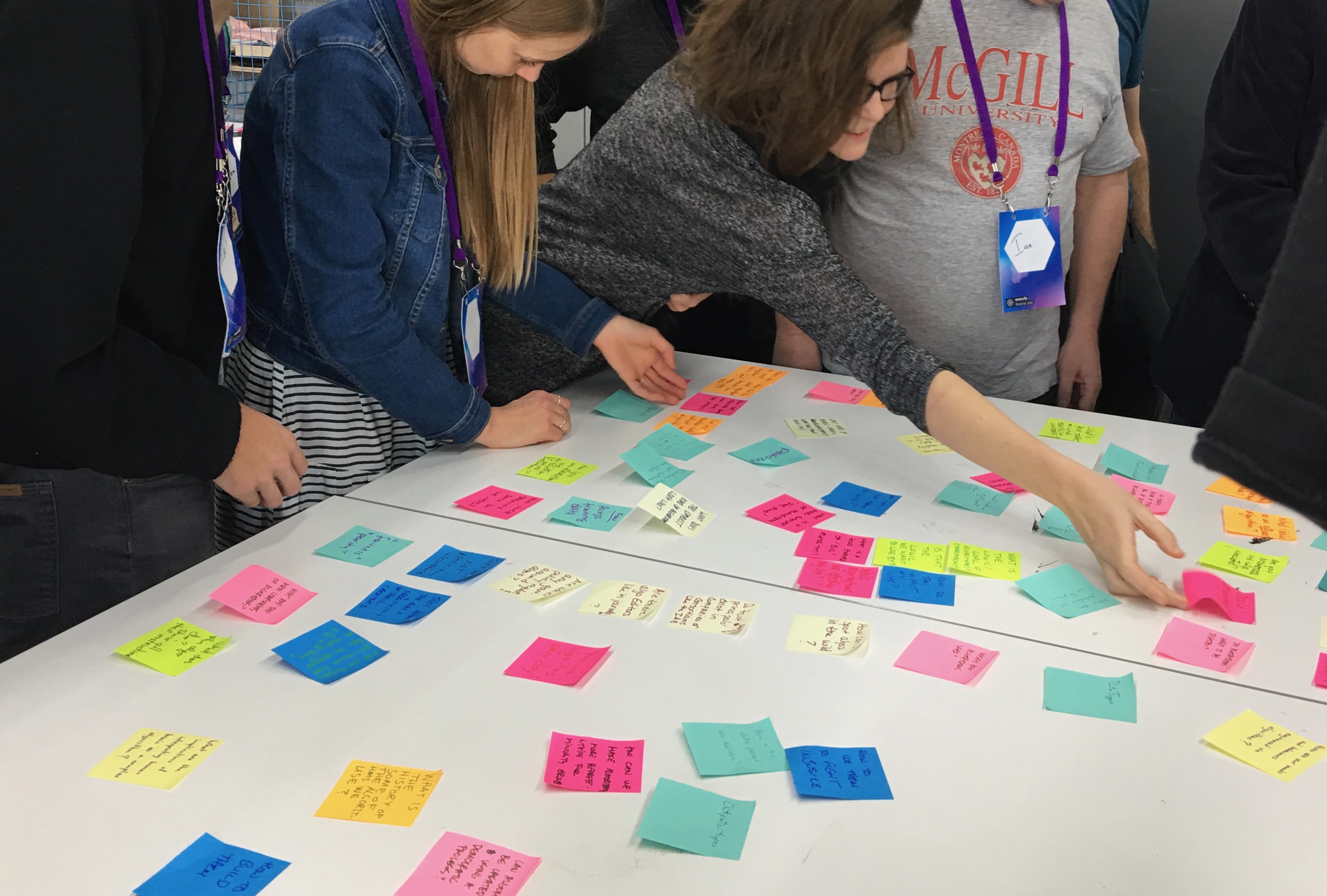
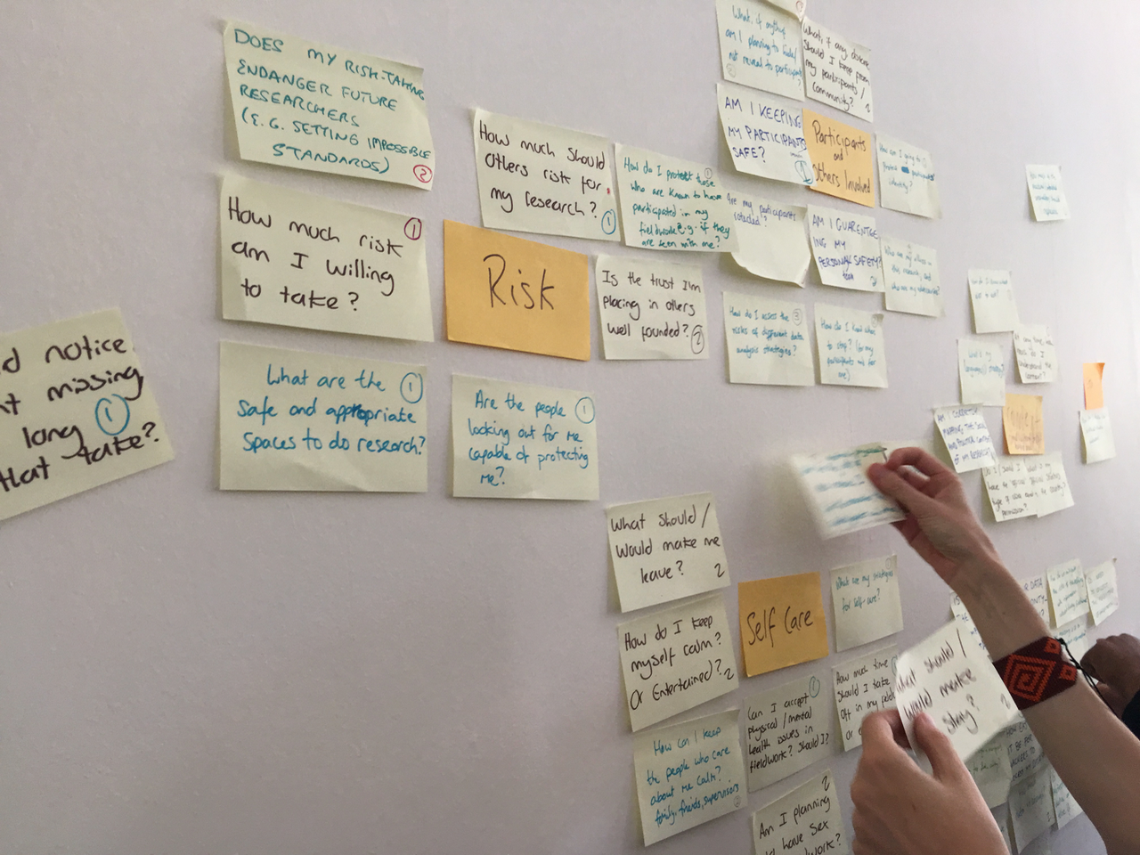
Next pass out post-it notes and markers and ask them to write down at least three things that they want to accomplish in the workshop. After 10 minutes get them to put the post it’s on the wall and ask the participants to group the common themes. After this is done, ask them to reflect on what is there.
What is Data?
In plenary (large group), ask people to tell you what they think when they hear the word ‘Data’ – Capture their responses on a piece of flipchart paper. After everyone has gotten a moment to contribute, point out where there are differences and where there is commonality. Stress how important it is to not assume that everyone is defining a word the same way.
Then say: “for the duration of this workshop, let’s define Data as:”
Discrete pieces of information, such as amounts, prices, measurements, dates, names of places and people, and addresses. AND, facts and statistics collected together for reference or analysis.
What data is in a piece of fruit?
Pass out a piece of fruit to each participant (apples work great). Get participants to break into pairs and make a list of all the different data they think the apple contains or represent. Likely they will come up with answers around nutrition (calories, vitamins, sugar) and prices, place grown, etc.
After they have had five minutes, get them to think about what data would come from a bushel of fruit.
Run the Spectrogram exercise. 60 Minutes
Make sure you get the participants to ‘crowdsource’ controversial statements about ‘data and social change’ before you run the spectrogram.
After your last spectrogram statement, point out the importance of how people have ‘heard’ the statement and also how people have reacted to the statements made in response. We always need to be aware of how people will respond to what we say, but they will also respond in certain ways depending on who is saying it.
Break 15 Minutes
Data Pipelines and Lifecycles Signs Exercise. 20 minutes
Print the following in big text (each bullet on A4) – arrange randomly on the floor and ask your participants to put them in order. Allow them to keep working it through until they think they have finalized the order.
- Ask a question
- Identify Your intended impact
- Identify Your Users
- Learn about your users
- Get/Find Data
- Process (organise/clean) Data
- Analyse Data
- Present Data
- Mobilise and Build Community
They will likely figure out that some bits are linear and the others are cyclical. What is linear is the pipeline:
- Ask a question
- Get/Find Data
- Process (organise/clean) Data
- Analyse Data
- Present Data
While these pieces are more cyclical:
- Identify Your intended impact
- Identify Your Users
- Learn about your users
And the bit you need to be doing the whole time:
- Mobilise and Build Community
And you will need to be repeating all of the above and learning during each iteration.
The stakeholder mapping and power analysis exercise. 40 minutes
In order to better understand your intended impact and really be able to learn about your users, it’s helpful to run a stakeholder mapping and power analysis exercise.
Lunch
The Data and Advocacy Visualisation Gallery. 60 Minutes
Preselect several advocacy oriented graphics and print them on A3. Be sure to choose a range of heavy data use to those that only use things like visual metaphors. 12 is a good number. Put them up are und the room with an equal amount of space between them and put post-its with numbers underneath each one. Try to disperse complicated ones evenly between those not so complicated to avoid bottlenecks when you run the exercise.
Break people into groups of three (count off these) and ask them to scrutinise each poster and decide:
- What’s the message?
- Who is it for?
- What’s the evidence or data contained? Is their a source cited? Do they think the source is credible?
Get the groups evenly dispersed between posters and have them work clockwise until they have looked at all the posters. People will want to take notes and thats fine. Give them a set timeframe – say 36 minutes and let people know that they only have three minutes at each poster.
After people have viewed all the posters, sit in a circle and have a discussion. The facilitator should ask:
- Which ones were the most effective? Why?
- Which ones were the least effective? Why?
Try to surface that the audience is really important and the one’s that work best will have had their audience strongly in mind. Talk about how different audiences might understand a visualization differently than others. Then ask:
- Which ones are relevant to their own campaigns/projects?
Break
What story does your data tell? 20 minutes
Building on the inspiration of the gallery exercise, now turn the participants to their own data.
In pairs – get people to talk about who they are trying to engage with their data. They should use the stakeholder mapping exercise to determine what types of people these are. They should think about what their users will find interesting and valuable about their data and ultimately what is it they want their data to do. What is the story the data tells?
Drawing Draft Visualisations. 40 minutes
Next get them to draw a visualisation of their data based on the story their data tells. Use flip chart paper and markers (80’s glam sharpies for the win!). Don’t be over prescriptive on what they should draw but remind people that their artistic abilities are not being judged, stick figures will be fine. If you have people working on the same project, they should work together. If they don’t have others working in the same project, then they should work in pairs. But every project should have their own draft visualisations.
Draft Visualisation Gallery. 20 Minutes
Arrange the draft visualisations around the room and get people to walk around and look at each of them. After everyone has had a chance to see all of them, ask for reflections or clarifying questions on what they have seen.
Closing Circle. 15 minutes
Ask participants to share a major learning or ‘aha’ from the day.
Handouts
A list of resources to be shared at the end of the day can be found here.


