

FabRiders finally has its own logo and social media icon! Since 2012 we’ve been busy establishing FabRiders and building up a substantial body of work. Though we have put it off, what surprised us is how quick the process of the development of the logo actually turned out to be. Working with Lynne Stuart from Idea in a Forest, we were able to start from scratch to final design in about four weeks. Here’s what we learned from the process:
Know what you want your logo to do. Because we had waited so long, we had a pretty clear understanding of what our logo needed to do. It needed to function as a recognisable image representing FabRiders’ work. It needed to convey that we work globally and not appear overly western. FabRiders’ work focuses on Technology Capacity Building, largely with organisations working on transparency and accountability issues or the rights of marginalised communities.
It needed to give people the impression that we’re approachable, that we understand local issues as well as international ones and that we’re about engagement rather than technology. We also wanted our audience to understand that the ‘Fab’ (for Fabulous) and the ‘Riders’ (from circuit riders and eRiders) were two parts of a whole.
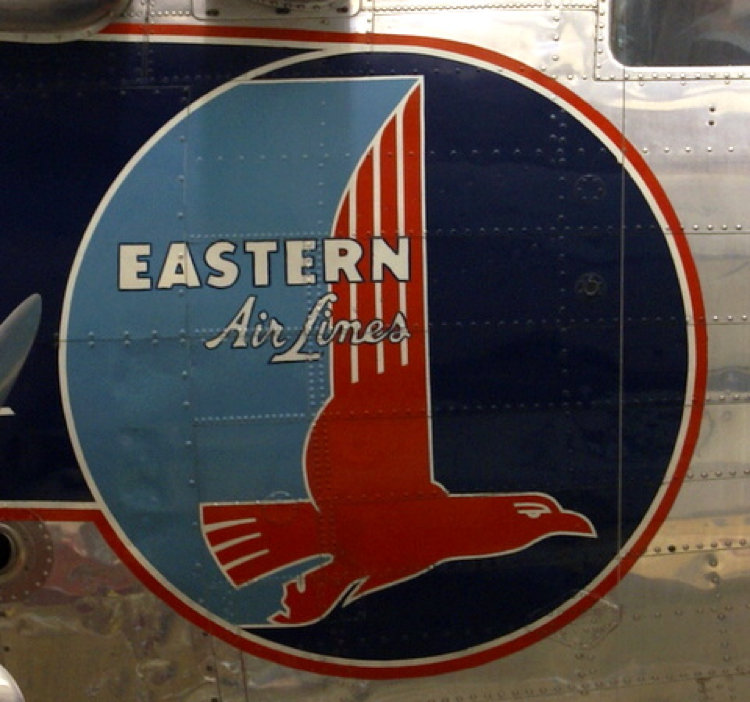
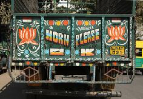
Get inspiration. We did spend quite a bit of time looking at a lot of different logos. Mostly we were drawn to simple, bold graphics from the 50s or 60s, particularly those used by airlines and train companies. I found myself drawn towards photos of logos that I’d taken when visiting developing countries.


A good graphic designer is worth their weight in gold. Whatever you do, don’t think that you can save some money by designing a logo yourself. It is worth the investment to get someone to do it for you. That said, It’s important to choose a graphic designer who can understand your audience and the aesthetic you need, and, most importantly, someone you can communicate with. I had worked with Lynne in the past and having an established relationship was a huge help to us both. I knew her work well, I had a good understanding of her capabilities and I knew that I could trust her to deliver something special. If you don’t know a graphic designer well, be sure you give a good look through their work. If you don’t see anything that grabs or inspires you, it’s best to move on.
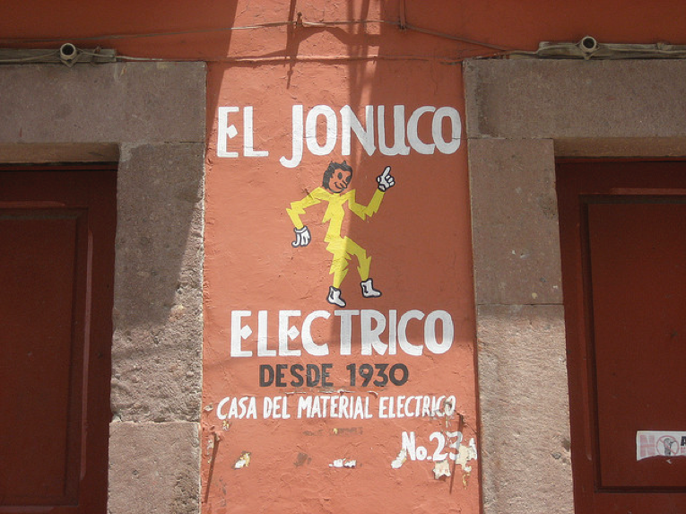
Put as much detail into a design brief as you can. This will save you time, money and headaches. Describe your audience and how you want them to respond to the logo: the ‘look and feel’. Include those images that inspired you. We were aiming for something that looked a bit analogue and lo-fi. The part of the brief that helped Lynne really understand what I was after was ‘make it look like a logo that you might see on the back of a lorry when you are stuck in traffic in Bangalore’, along with the selections from the inspiration board.
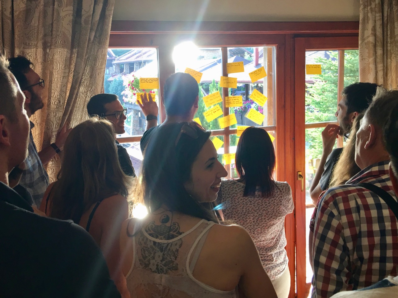
Don’t trust your own opinion. As Lynne developed drafts of the logo, we got other people to look at them and give me their opinions. I was really fortunate to have Lucinda Linehan from the Kitchen Agency on hand to give me her reactions. Lucinda has helped lots of international NGOs develop data visualisations and graphics, and she was able to give me a very objective opinion on the rough drafts Lynne was producing. She confirmed my inclinations on the font and colour choices. Also, showing it to my husband for his views, particularly as he understands design but doesn’t work in our sector, proved invaluable. He pushed me towards a more simple design. I also managed to get it in front of a few clients, and took note of their reactions. But it’s fair to say, I got lost looking at all the drafts, and other people’s opinions kept me focused on what worked and what didn’t.
-

An Early Draft

In the end Lynne produced two lovely graphics: one has the full name and highlights the ‘Fab’ from the ‘Rider’, which is a critical part of the identity and will go on the website, letterhead; the other is a simpler smaller icon for use with social media and my business card. I’m currently in the process of producing some stickers and toying with the idea of T-shirts. We’ll see! What I’m most impressed with is that the logo does not look western, but that it also doesn’t look like a cultural appropriation of something non-western. It encapsulates FabRiders’ body of work in helping organisations learn how to engage local people, and also the direction we want to head towards in supporting stronger, smarter activist and advocacy campaigns.


